Summers in France by Caroline Clifton-Mogg
Published by Ryland Peters & Small (£35)
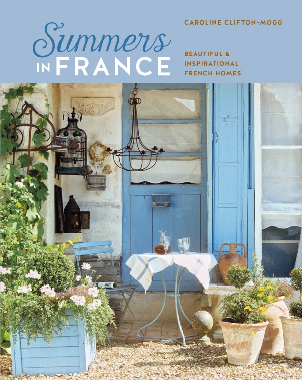
Photography © Ryland Peters & Small
Join Our World... Sign up for our exclusive newsletter.

Be inspired every day with Living North


In a high-ceilinged dining room, the first impression is one of colour and contrast. But in fact, there is practically no colour at all: everything from walls to woodwork to furniture and linen is in graduated tones of grey, blue-grey and soft white.

The calm atmosphere in this bedroom is created by the painted wooden walls – finished to look almost powdered. A screen, used as a freestanding headboard, has been covered in a neutral material, and the polished-concrete floor reflects all the colours back.
The French rural colour palette is like no other. Soft and almost translucent in appearance, it gives the impression that the base colour has been washed over, creating the effect of a multilayered film of colour over a creamy background.
On first telling, the names of the colours associated with the French country interior sound much like those of colours used anywhere else: blue, grey, cream, green, pink. Simple enough, you might think, but – as always with the French – the difference lies in the way they tell it.
French colours are mixed to a particular subtlety and depth – if that sounds as if they might be boring or dull, nothing could be further from reality. However, it is true that nothing shouts, and there is nothing about the colours that is either flashy or exhibitionist. These are colours that both soothe and evoke interest, that have character and depth, that are designed to alter in different lights – but also always complement and enhance the other elements of a room.

Left to right: One of the tricks of success when decorating with a French country palette is to avoid combining sharply contrasting colours. Attempting to create a harmony of complementary tones may be more challenging, but the end result will make it all worthwhile.
This room was originally the kitchen, hence the pleasing panel of ceramic tiles set into the wall beneath the window. The design echoes in miniature the larger design of tiles on the floor, and every element is kept deliberately low-key.
The colours in this comfortable living room are neither bold nor intimidating. The cupboard is a fine antique buff et à deux corps (one cupboard above another), coloured in soft pinks and greys. The two antique armchairs – known as chaises à la reine, and dating from the reign of Louis XV – are left polished and pale.
The natural light of a particular terrain affects the way in which decorative colours are perceived. France is a large country, and the light changes dramatically from the north to the south (as well as from east to west). These natural differences are reflected in the way that colours are used – both inside and out. The further north you travel, the more you find shades that are paler and more limpid, echoing the huge Northern skies. In the predominantly sunny South, however, the tones are stronger and more definite – reflecting the sharp contrasts to be seen in the surrounding landscape.
Traditionally, of course, the colours used were dependent on the local pigments. Different areas used local ingredients to make the pigments; other traditional recipes included limewashes and milk washes, and grey- or green-toned distemper.
White – as a decorative colour rather than a no-choice neutral – has always been favoured by the French. Their oil-based white does not have the cold brilliance of a modern acrylic white, but is instead subtle and sophisticated. It is represented in the white paintwork set off with gilding, as admired by Madame de Pompadour, and the soft whites favoured by Marie-Antoinette when she played at country life in the Petit Hameau; such rustic, gentle tones were supposed to reflect the natural, simple quality of the queen’s life away from court (although her idea of simplicity would possibly not have been shared by most of her subjects).
These French whites are sometimes creamy, sometimes touched with grey and often have the soft texture of chalk. Very often several different shades of white were and are used together – a look much admired by the late English decorator John Fowler, for example, who was himself much influenced by the French colour palette of the past. Fowler would combine many different – but only slightly different – tones of white on woodwork and plaster details and in panels; he was always looking for a harmonious, restful, architectural composition that suggested rather than dictated.

A symphony in sage, with grey-green used in different strengths: slightly deeper on the woodwork and chimneypiece, as well as on the painted floor. Slightly paler on the painted beams – a harmonious whole.

This room takes its cue from the worn pink of the terracotta floor tiles and from the plastered wall and painted panelling. In the same palette, the daybed has stripes of clover and rose with abundant cushions in Indienne and toile de Jouy designs.
Other neutrals are also popular in the French country palette, but again they always have a subtle twist. Rather than a clear cream, for example, a soft putty colour – cream mixed with an infinitesimal amount of grey – can often be seen. Indeed, grey, whether combined with white or not, is pretty ubiquitous; a pale version of grey was the popular colour of the 17th and early 18th centuries, often contrasted with off-white – an immensely sophisticated combination. This domestic grey is nothing like the institutionalised, rather dead tone so often seen in French municipal buildings, but a more delicate colour – almost luminous, lighter, reflective and often with a pale pink or blue base that gives it a fresh or warm tone. And the colour is often mixed or contrasted with other shades of grey – a chalk grey might be combined with a deeper, dove-wing grey in panels and woodwork, for example, and lifted by touches of creamy white. From grey comes blue and – except in those interiors influenced by the heat of the Mediterranean – most French blues are reflective, reflecting colours, used to calm and soothe. When grey-blue is not required, an alternative commonly seen is a watery, pale turquoise, again often used in combination with a creamy white.
As with blue, so with green. In nearly all French greens, whether pale or strong, there is a little grey – or sometimes black – in the mixture. Not for France the cheerful emeralds or mown-grass greens of other places. Subtlety is both the goal and the prize. From grey also come mauve and lilac – either as bright as the viola or iris or closer to the quiet, almost musty tones that are quintessentially French, and which look so winning when teamed with a grey-green, perhaps used on woodwork. A more sophisticated combination that is sometimes seen is a grey-mauve off set by a dark, almost terracotta red – the red known as sang-de-boeuf makes a particularly effective contrast. Pinks and peaches are also to be found among the range of French country colours, but they are not childlike nursery colours – there is nothing of a sugary or sweet nature about them. Like so many French country colours, the pinks and peaches appear almost organic, seeming as though they might have emerged from the colour of the original plaster rather than having been applied on top of it, and again, they often seem to include a hint of pale-grey ancestry.
No country colour palette could be complete without yellow, but French yellows stand apart from their competitors in tone and warmth. The yellows that French people prefer to use in their interiors are on the whole neither too sharp or strident nor too deep; they are the yellows that are easy to live with and acceptable to all – diluted chrome yellow, saffron mixed with white and butter yellow softened, appropriately, with cream.
Then there are the decorative colour combinations – those important marriages of woodwork and wall. It is rare in France – at any rate, among exponents of this particular style – to observe a strong, violent or dramatic contrast in a room. A subtle combination, something that pleases or interests and which incorporates other elements of the room is preferred. The French have never felt that the only colour for woodwork is white – in fact, in many cases, they consciously shy away from this most obvious of tones. If white is used, it will be an off -white, but it is just as likely to be grey, or it may be green or blue, or sometimes a mixture of the two.
In a French country house, all the interior elements that are made of wood – not just the architectural surrounds – may be coated in paint. Like the Scandinavians, the French particularly like painted furniture, and the soft and subtle colours they favour are as effective on furniture as they are on walls; to the French, a painted finish is as charming, if not more so, than the patina of old wood.
Dedicated paint strippers take note: in the 17th, 18th and 19th centuries, furniture was, as often as not, painted – and those who today religiously strip back any painted pine piece they find in the name of authenticity are often destroying its charm by changing it into something that it was never intended to be.
Published by Ryland Peters & Small (£35)
Photography © Ryland Peters & Small