Heritage Style by Selina Lake, published by Ryland Peters & Small (£25) Photography by Rachel Whiting © Ryland Peters & Small
Join Our World... Sign up for our exclusive newsletter.

Be inspired every day with Living North


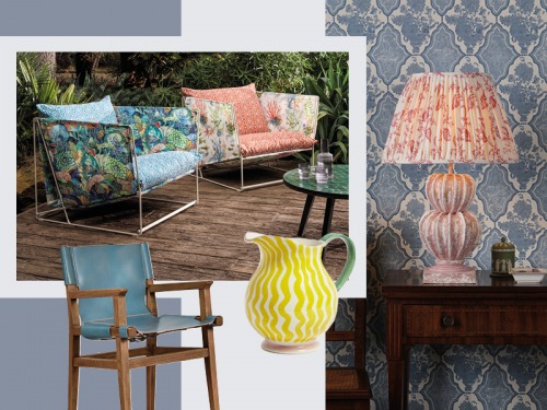
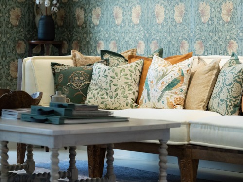
Colour and pattern are key elements of heritage style and there is a huge range of heritage paint colours as well as wallpaper and fabric patterns to choose from, with many companies looking to the past and historical properties for inspiration. Others have reproduced classic wallpaper designs and relaunched historic colours for use in modern-day homes. Heritage paint ranges tend to be fairly classic (you won’t find an acid lime green or neon pink), meaning they work within a wide variety of settings. They can be grouped into four categories: whites, which tend to be off-whites with warm undertones; pale tones, consisting of soft, grown-up pastels; mid-tones, which are easy on the eye, slightly muted and used to create cosy spaces; and finally deep tones, which are rich and dramatic. There is something to suit all spaces in period or new properties.
Traditional wallpaper patterns, which were frequently inspired by nature, are often block printed in the same way now as when they were first produced. Classic designs, such as checks and stripes, are eternally popular, with gingham and wide stripes being particularly on trend at present. And the modern process of digital printing allows historic works of art to be reproduced as wallpaper or murals, converting tapestries and paintings into affordable yet timeless wall coverings.
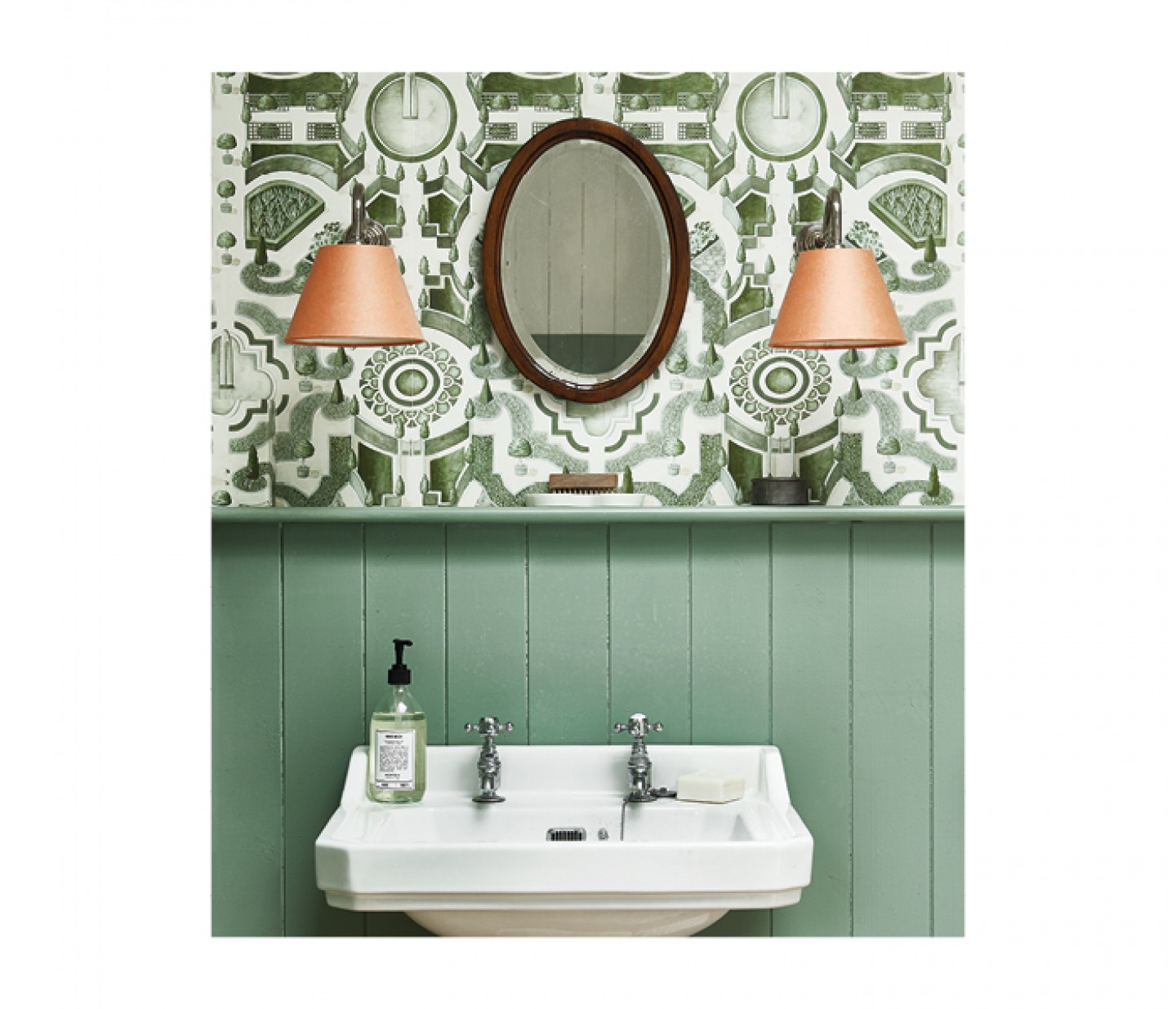
^ Classic tongue-and-groove half-wall panelling painted in a soft green shade plus Topiary wallpaper in Leaf Green by Cole & Son is a smart and timeless combination.
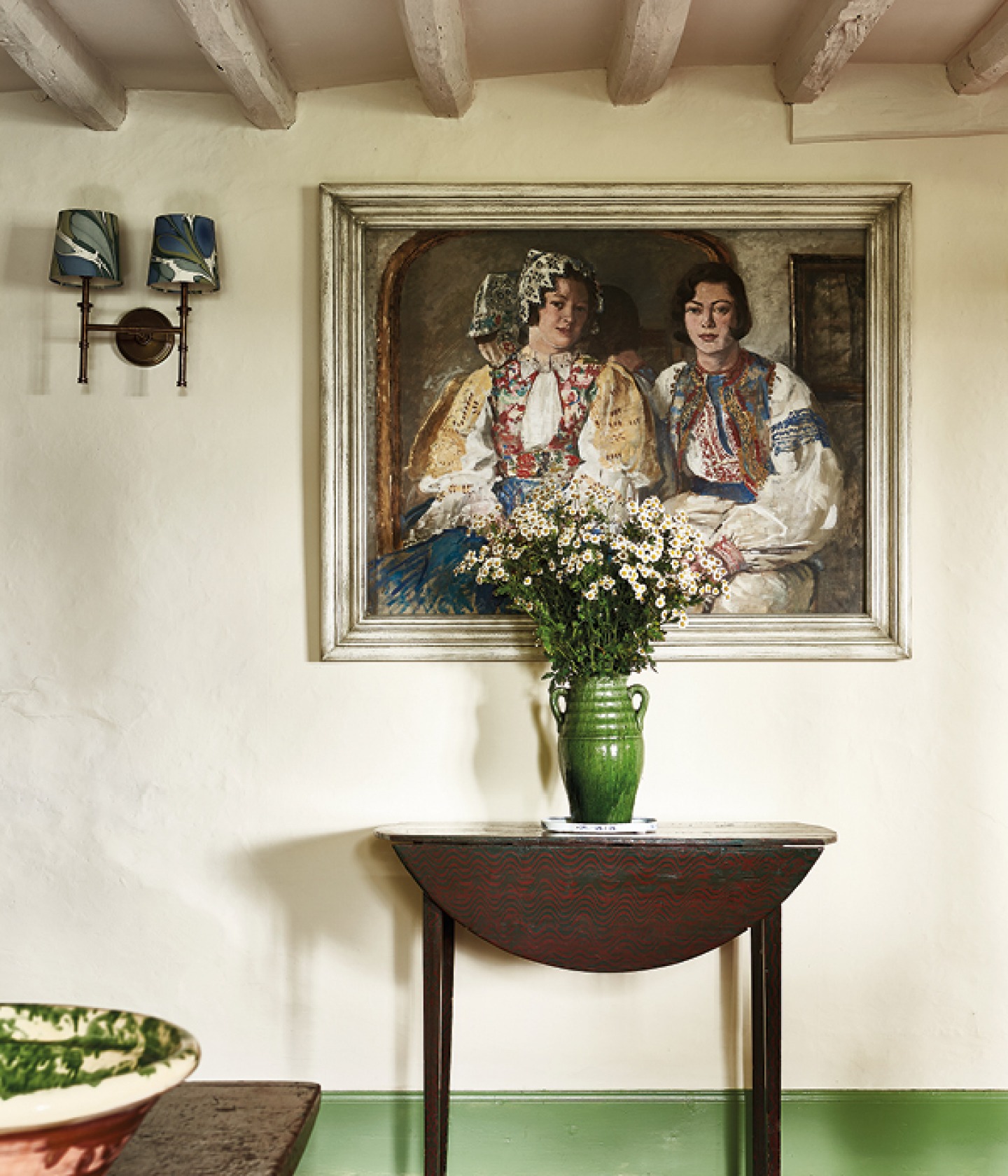
< Objects of Desire: Use treasured artworks and artefacts as the basis for a colour scheme.
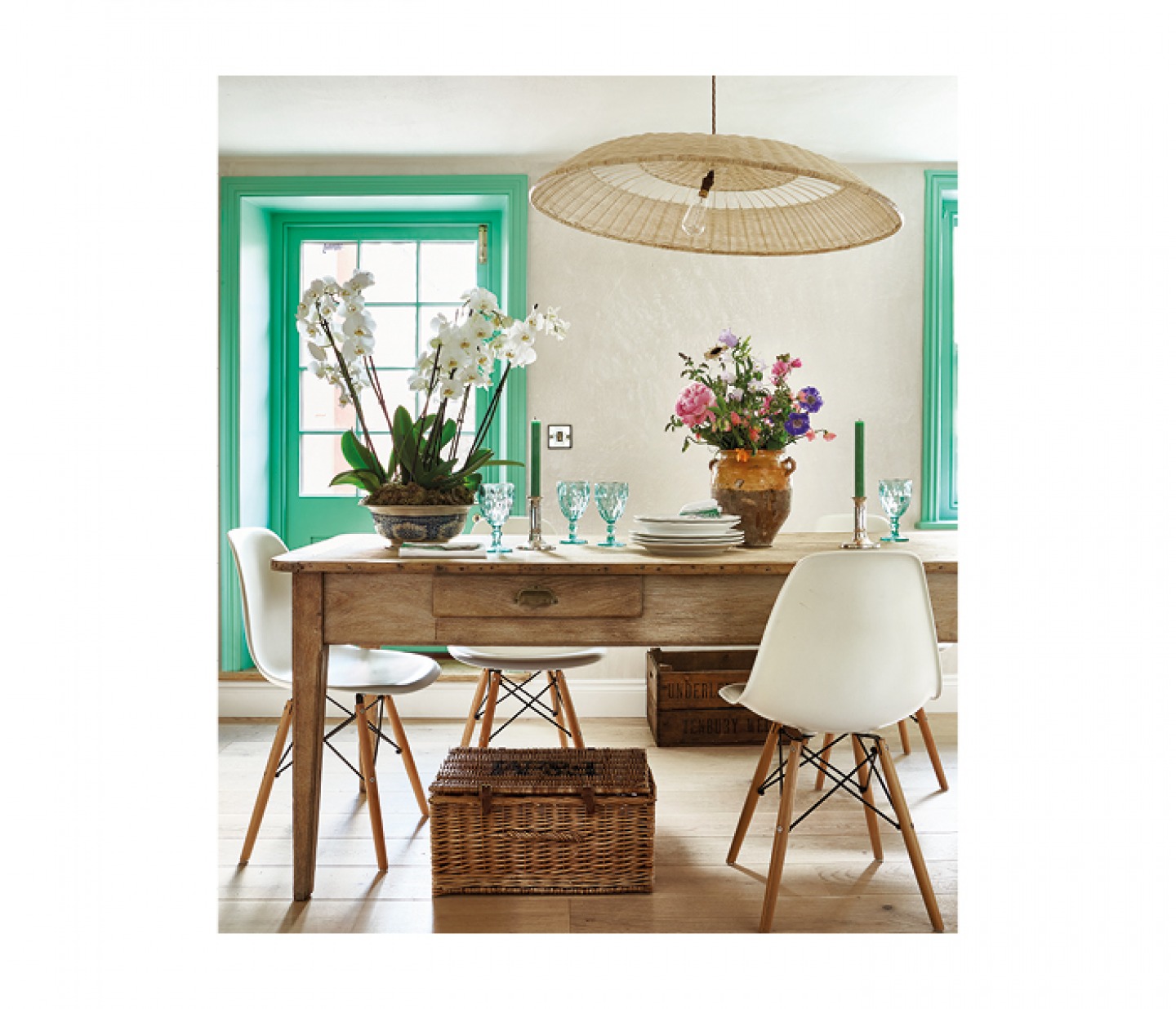
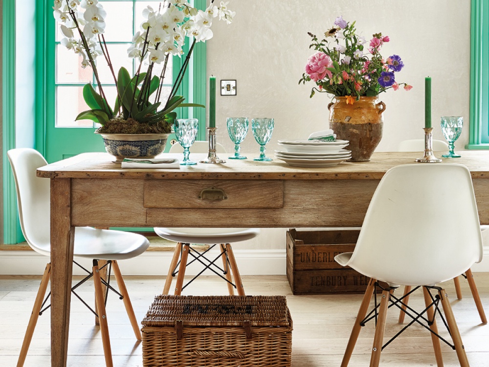
^ Elizabeth Rose has used Green Verditer by Little Greene to add a pop of colour on her kitchen door and window.
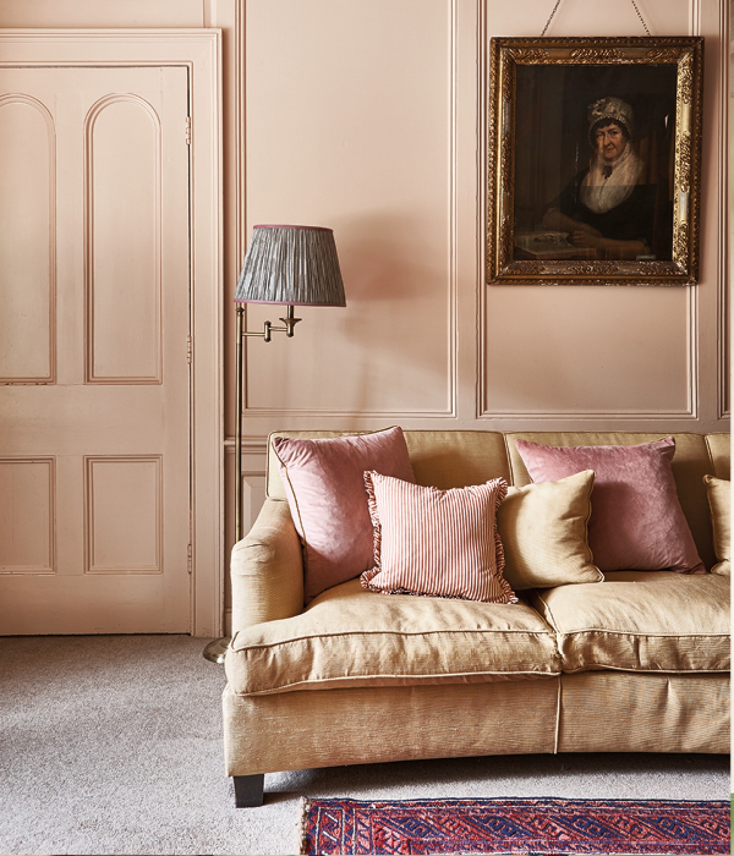
> A plaster pink colour covers the doorway, door frame and Georgian panelling in this living room. The gold silk sofa reflects the natural tones of golden sandstone and harmonises with the walls and cushions.
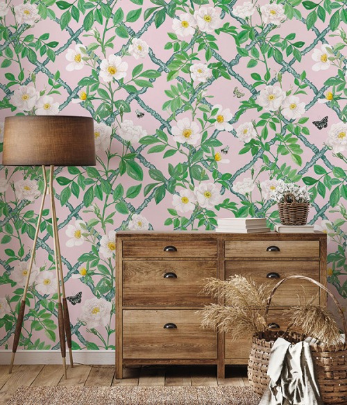
Fresh greens and ochre: If in doubt, go for green – after all, it’s the colour of nature. Fresh greens combined with warm yellows will create a pretty, fresh feeling, especially when used in conjunction with untreated woods, natural fibre rugs and washed linens.
Soft pinks and earthy tones: Clay, plaster and powder pink tones are soft colours, used in any room in the house to add warmth and a subtle, grown-up elegance. These pastelly, earthy neutrals work perfectly in a heritage home, and combine well with deep reds, muted mustards and rich ambers.
Heritage Style by Selina Lake, published by Ryland Peters & Small (£25) Photography by Rachel Whiting © Ryland Peters & Small