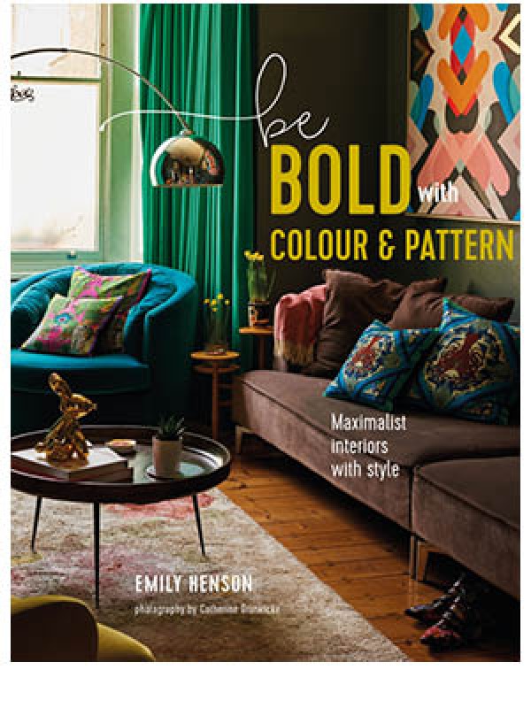
Be Bold with Colour and Pattern by Emily Henson, published by Ryland Peters & Small (£25) Photography by Catherine Gratwicke © Ryland Peters & Small
Join Our World... Sign up for our exclusive newsletter.

Be inspired every day with Living North


I want you to think about the colours you like and want in your life (later we can talk about adding colour and pattern in the form of textiles, furniture, and accessories). Nine out of the twelve homeowners we visited for Be Bold have used colourful paint to customise their homes, each of them creating totally different looks. (The other three made up for the lack of bold paint treatments with some very gutsy wallpaper and furnishings).
You can test the waters by spray-painting something small – an old lamp base or a wooden stool perhaps. Usually people get hooked on the satisfyingly immediate results and begin spraying everything in sight! Tatty old furniture or new pine flat-pack pieces can be completely transformed with a coat of bright paint.


When adding colour to your rooms, you have options. If you don’t want to cover the whole room, try painting part-way up the walls and leaving the top half white. If you discover an interesting plaster finish beneath ancient wallpaper and leave this exposed, so much the better.
I prefer this look to a feature wall, which has had its moment. Alternatively, you could use two different colours on a wall – either complementary or contrasting hues – to create a simple graphic block. Another option is to create a contemporary mural, using masking tape to mark out a graphic design and painting only within the taped areas.
For those of you ready to dive in at the deep end, just go for it! What’s the worst thing that can happen? You won’t like it and you’ll have to repaint. That’s not the end of the world. Choose one shade and paint everything – walls, ceilings, doors, woodwork, radiators – for an intoxicating and enveloping effect. If this sounds like too much, choose a main colour for the walls and ceiling and one or two accents for doors, shelves and so on. Bear in mind how colours in different rooms complement each other when you look from one space to the next. I don’t mean they should ‘match’ (whatever that means), just that they should appear pleasing side by side. Notice colours that work together in fashion, nature, and art, and try them at home. Navy and orange, chartreuse and bubblegum pink, and fuchsia and olive are examples of unexpected but exciting combinations. Do some research, make a moodboard and find out what evokes a positive emotional reaction.

Painting wooden floorboards isn’t a new idea, but rather than opt for white, why not try something more daring? Keep in mind that if your floors are bright green, you may want to tone down the furniture, going for earthy neutrals rather than strong shades. Consider painting one area only – a graphic design can delineate an area, rather like a rug.
Lastly, don’t forget often-overlooked areas such as the interior of kitchen cabinets, window frames and stair risers. Often they are an afterthought when decorating, getting the traditional white paint treatment. Why not think of them as another opportunity to express yourself and personalise them with colour?
Be Bold with Colour and Pattern by Emily Henson, published by Ryland Peters & Small (£25) Photography by Catherine Gratwicke © Ryland Peters & Small