How to Use Bold Colours Inspired by Nature
Using bold colours in your home can be daunting – but take inspiration from nature and you can’t go wrong


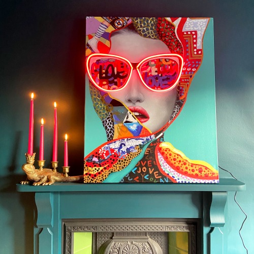
BOLD
Choosing a bold and bright colour scheme takes courage, as it will dominate your space and divert much of the attention from everything else in the room. At the same time, it makes a brave statement and the bright, happy colours will put a smile on your face. Bold colours usually complement each other and so mix well, and can be used to accessorize a light or dark home. If you use a bright colour scheme for the backdrop, dark furniture and furnishings can be added to create a look that is not bold through and through. I love visiting a home with a bold colour scheme, as it is such a personal choice, and one thing is for sure: it will stand out among all the neutral interiors.
BOLD INSPIRATIONS
When it comes to nature, bold colours mostly appear in moderation. Of course, there are some exceptions, but you are more likely to find small bursts of happy colours rather than large expanses of bright hues. My view is that if you mimic the way bold colours are used in nature when you are decorating your home, the result will be very successful. I always find it so exciting when the dark winter days become brighter and lighter, and nature explodes into colours that announce to the world that spring is here. From the moment the trees produce their first light green leaves to when fields of poppies and rapeseed flowers brighten up the landscape, it makes all the difference to my mood and gives me a renewed boost of energy. Using bold colours in the home can have a similar energizing effect, as it will always feel like spring has just arrived.
Much like the joyful chaos and flamboyance of a circus, nature’s kaleidoscope of bright, happy colours cannot fail to put a smile on your face. Full of optimism and energy, a bold, bright palette will make your home feel like it is spring all year round.
NATURALLY BOLD
There are many bold colour inspirations to be found in the natural world in every season, but it is during the spring and summer months when gardens, fields and country roadsides really explode into colour. Foliage is lush and abundant, flowers come into bloom and it is a joy to be able to pick them from the garden to brighten up our homes. The range of bold colours found in nature covers the whole of the colour wheel and you can find almost any shade, from sky-blue flowers and deep pink rhubarb to bright red berries and golden orange fruits. All of these vivid colours make us happy when they appear, even though they are only with us for a short length of time.
It is sometimes hard to know why we like certain things more than others, why some things make us feel happy or sad, or why we prefer one colour to another. Blue is my colour, but if you were to ask me why, the only explanation I would be able to give is that my two favourite flowers are grape hyacinths (Muscari, above right) and forget-me-nots, and I love their rich saturated blue tones. They were my grandmother’s flowers of choice too; her garden was full of them in spring and I remember exactly how beautiful it looked. I loved spending time with her and these flowers remind me so much of her that they bring back wonderful memories.
Summer Colour
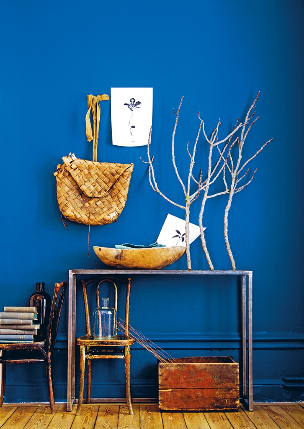
Although my favourite flowers, grape hyacinths, appear in spring, together with wonderfully scented hyacinths, I always associate the colour blue with summer – for the hot, sunny days with blue sky overhead. Painting your walls a deep blue will give you a sense of summer all year round, and you can add warmth with natural objects and colours. The console table and botanical prints were designed and produced by Drythings, and the furniture and accessories are flea-market finds.
Different Shades
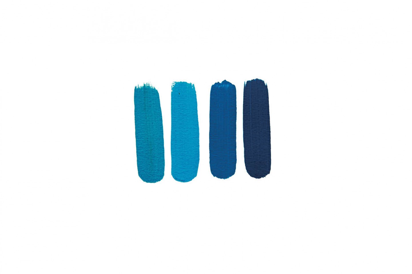
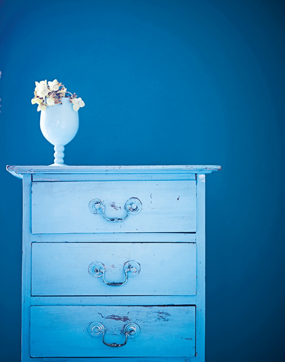
I could happily live in a completely blue room, as it would have such a soothing and calming atmosphere. Blue is a colour that works especially well when you layer up different shades to create a tone-on-tone effect, resulting in a harmonious interior with a sense of depth. Using a slightly darker blue backdrop with lighter furniture and accessories is a great way to make an interesting feature in your home.
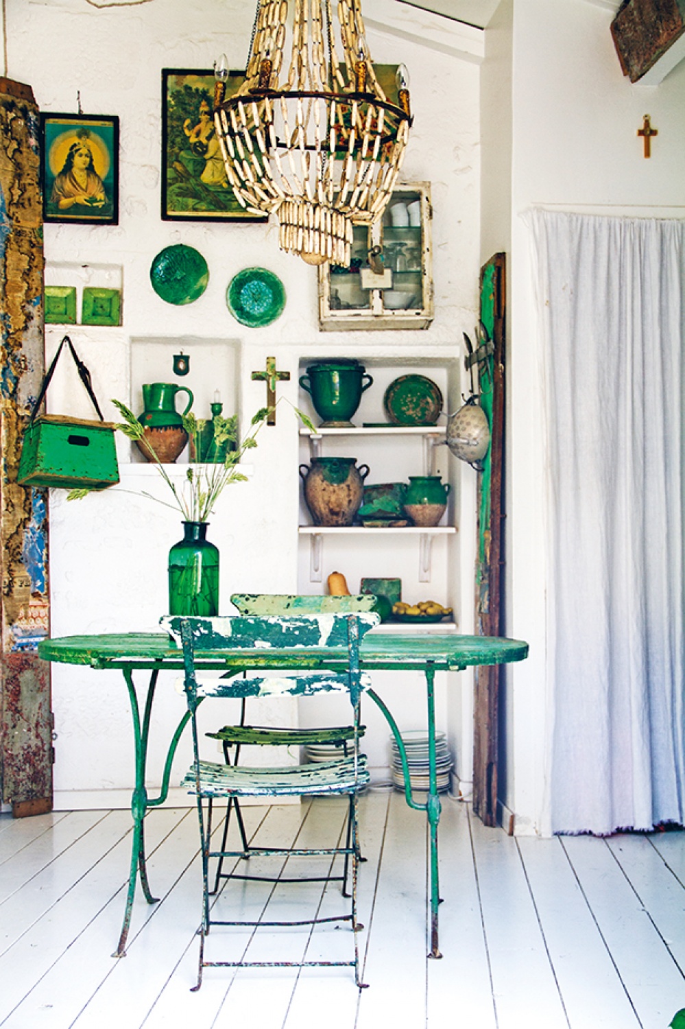
I don’t know how it came about that green is the colour we use to describe envy. The saying could just as easily have been, ‘I am yellow with envy’. But none of this matters when it comes to working with shades of green in the home because it is such a wonderful colour to live with, similar to being in a tranquil, leaf-covered forest. Just imagine how amazing it would be to live high up in a treehouse, surrounded by trees and their canopy of leaves. Bold green hues range from the lighter greens of new shoots to the darker greens of lush moss; some shades flirt a little with blue, while others have a purer green tone, but they all create a very calming atmosphere when used in the home.
Going Green
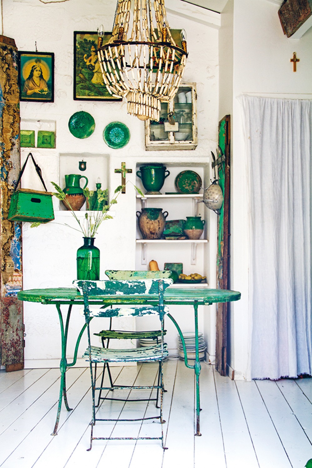
This otherwise white kitchen has been updated with a collection of furniture and accessories in different tints of green. The antique table and chairs define the central space, while vintage china and stone pots make a decorative feature displayed on shelves or hung on the walls. The layers of different shades of green harmonise beautifully and give the space a multi-tonal effect, all from within the same colour family.
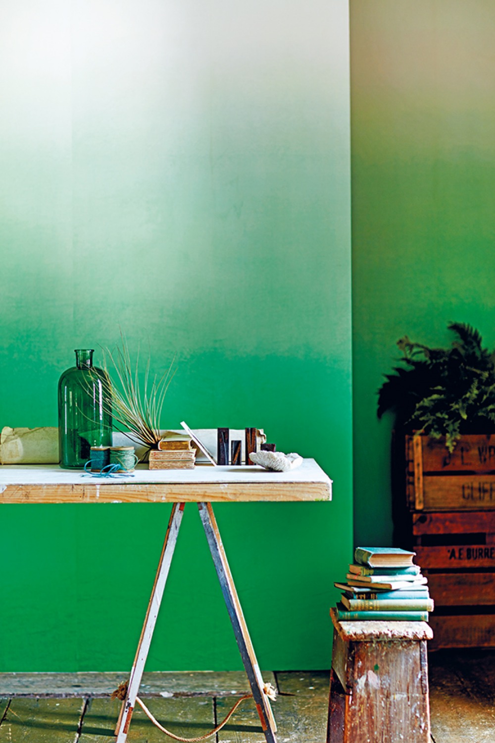
Shades of Green
So many shades of bold green look amazing in interiors. I recommend using darker tones as the backdrop and the brighter shades as accents, as they can be quite invasive if used on a large scale. Green colours are easy to mix – just look to nature for inspiration. A shaded green-painted or papered wall will work beautifully as a backdrop for darker green tones and pale colours alike, such as this simple trestle desk in front of wallpaper by Designers Guild.
MIMOSA, SUNFLOWER & MARIGOLD
One of spring’s most beautiful sights is a field of dazzling yellow rapeseed flowers, only matched in summer by an array of sunflowers with their heads all turned towards the sun. The most uplifting of hues, yellow instantly makes me happy and brings brightness and a feeling of summer. I recommend using it on walls, floors and even ceilings. It complements most colours, so you have the choice of adding other bright hues or toning it down with neutrals and pale accents. It is a colour you don’t often see in interiors, but I hope the following pages will make you consider it. This summery shade will create such a happy mood that I am sure you won’t regret choosing it for your home.
A VARIETY OF YELLOWS
When it comes to choosing a bold yellow colour for your home, you can either go for a clear, bright shade inspired by sunflowers and rapeseed flowers, or opt for a dirtier mustard tone. All yellows work equally well as the main and accent colours, but pure yellow shades will result in a lighter and brighter interior, whereas duller, greener yellows will create a slightly moodier look, so your choice is all down to the effect you are hoping to achieve. To my mind, you can never really go wrong when you choose a yellow colour scheme for your home, as it will always give you a happy outlook and be comfortable to live with.
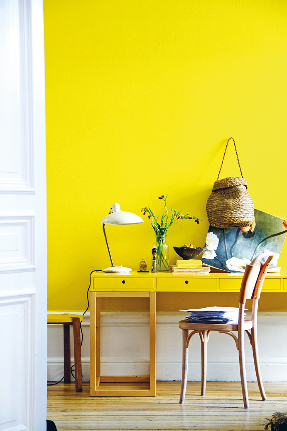
Hello Sunshine
Can you imagine living in an interior with a year-round summery feeling? Being greeted by a sunshine-yellow wall would always make you smile. The home office has been co-ordinated by using the same hue on both the wall and desk, along with natural wood furniture and woven materials for a layered, up-to-date look. The leather-backed bentwood chair came from the Gemla factory near my home town, and the poppy poster is from Drythings.
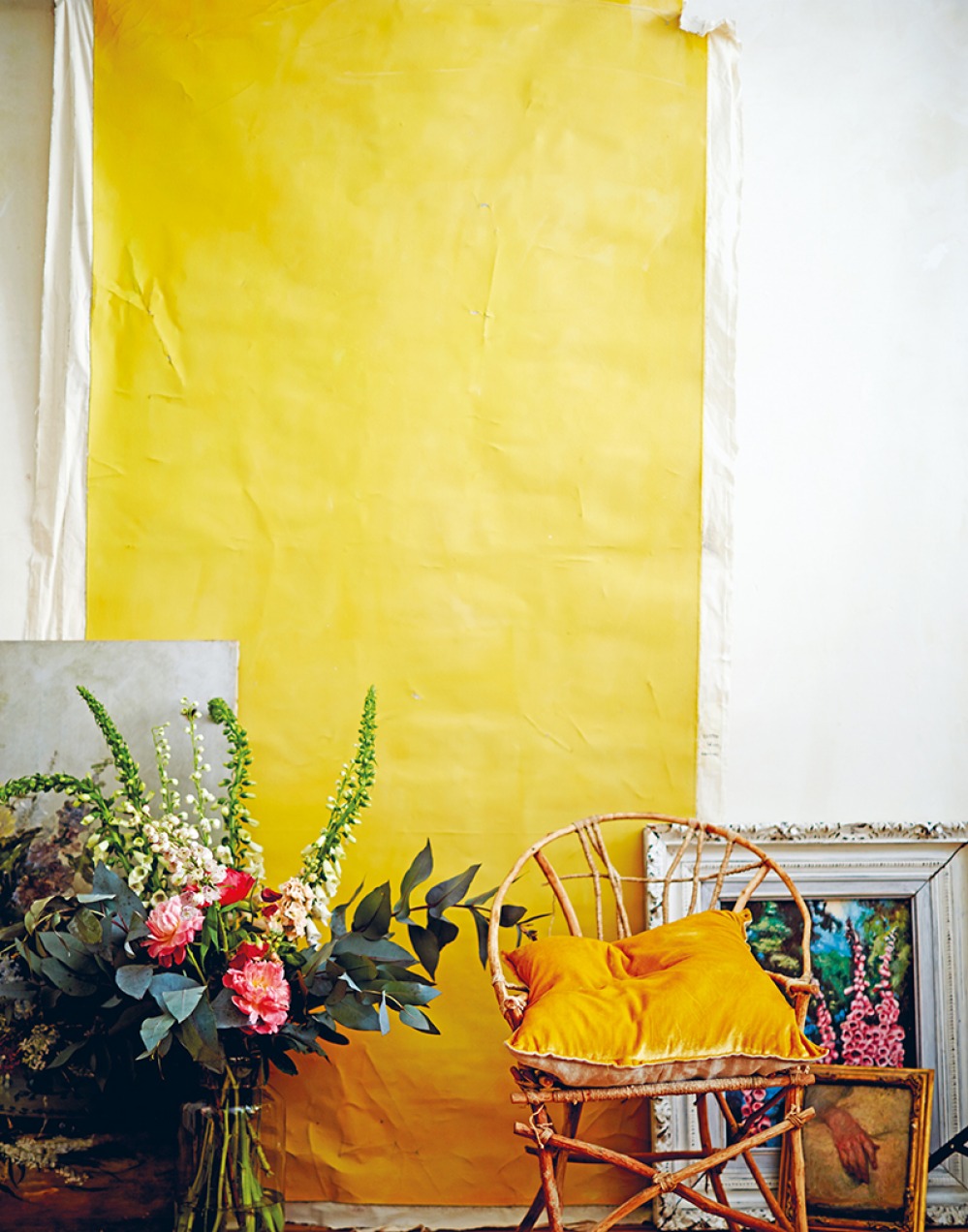
Adding Textiles
Introducing coloured textiles is an easy way to brighten up an interior. A length of canvas painted in a favourite shade and nailed to the wall will create a backdrop for any still life, while also adding contrasting colour.
Extracted from In the Mood for Colour by Hans Blomquist, published by Ryland Peters & Small (£25) Photography by Debi Treloar & Hans Blomquist © Ryland Peters & Small